Page 1 of 3
Screen Layout Rocking
Posted: Mon Mar 07, 2011 7:29 pm
by Bicchus Dicchus
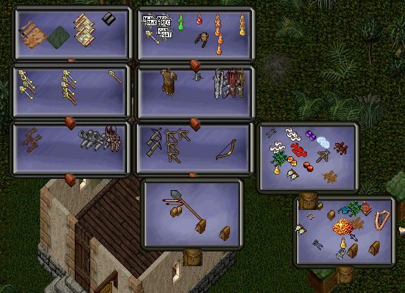
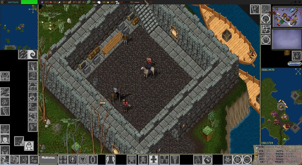
Howdy, just recently came up with this screen layout.
What do you think? How can I make it better? I'm thinking it's time to evolve past the basic "Screen in top left corner" look.
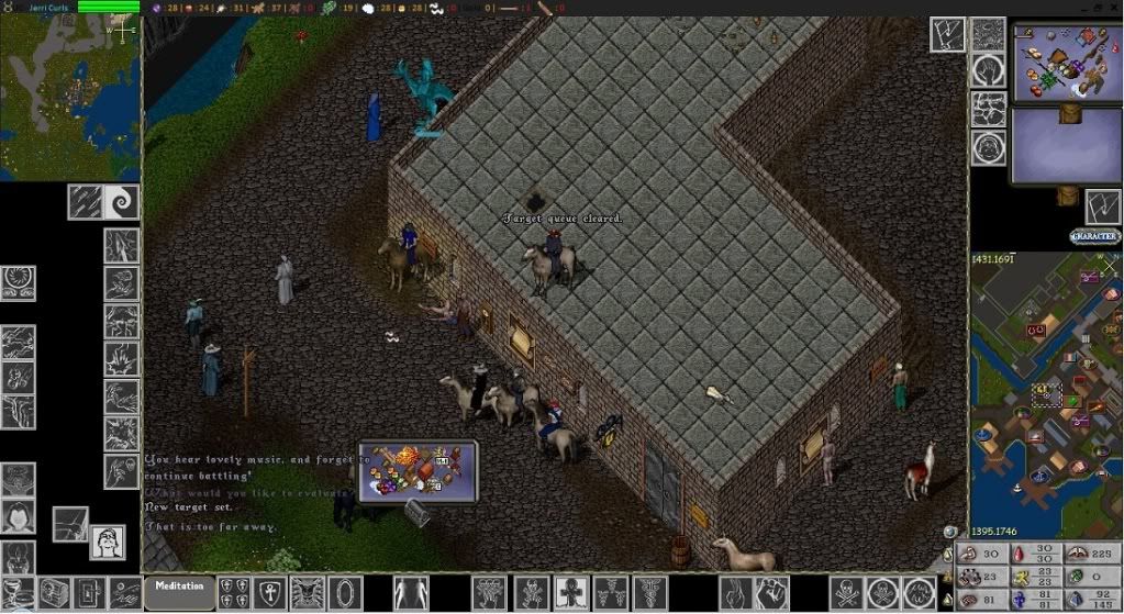
Edit: Retooled the Status gump, look in the bottom-right of this next picture:
Let's have a discussion. If you like, post your layouts and compare.
Bitches.
-Bicchus Dicchus
Re: Screen Layout Rocking
Posted: Mon Mar 07, 2011 7:58 pm
by nightshark
Personally I always keep the screen layout on the top left just to make it easier to run in that direction.
My layout is pretty basic but I have hotkeys for nearly everything.
Re: Screen Layout Rocking
Posted: Mon Mar 07, 2011 7:59 pm
by SJane3384
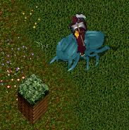
Does that lizardman in your sig have a giant erection? Also, what's with the black boxes on the boats?
Re: Screen Layout Rocking
Posted: Mon Mar 07, 2011 8:18 pm
by Bicchus Dicchus
makes shit easier to see, for reals dawg
Re: Screen Layout Rocking
Posted: Mon Mar 07, 2011 8:47 pm
by Panthor the Hated
looks cool
Re: Screen Layout Rocking
Posted: Mon Mar 07, 2011 9:08 pm
by Vemp
How do you get your bank box, and backpack that color and layout? Sorry if noobish.
Re: Screen Layout Rocking
Posted: Mon Mar 07, 2011 9:30 pm
by Mens Rea
I like it I want my UO to look like yours plz
Re: Screen Layout Rocking
Posted: Tue Mar 08, 2011 12:23 am
by Bicchus Dicchus
I've worked with the client for many years, and my main focus is efficiency.
Making easier to see, and making easier to pick up.
How much fun is it to pick up a bunch of spider silk? Or diamonds? Black pearl? Look at my backpack in those pics.
All those empty pixels that make stuff harder to pick up... I've fixed. Well, most of em. Still a work-in-progress right?
-Bicchus Dicchus
Re: Screen Layout Rocking
Posted: Tue Mar 08, 2011 12:43 am
by Bicchus Dicchus
Re: Screen Layout Rocking
Posted: Tue Mar 08, 2011 2:19 pm
by SJane3384
I found this site awhile back too. Pretty cool.
http://www.uo-desktop.uoo.ru/news_e.htm
Re: Screen Layout Rocking
Posted: Tue Mar 08, 2011 2:43 pm
by Panthor the Hated
those are some pretty nice graphics
awesome
Re: Screen Layout Rocking
Posted: Tue Mar 08, 2011 3:09 pm
by SJane3384
I might use that customization program and make a few of my own. I'll throw them up here if I ever get around to it.
Re: Screen Layout Rocking
Posted: Tue Mar 08, 2011 8:10 pm
by Berock Shagando
Bicchus, your smaller items like the BP and the Garlic look as if you've enlarged them to make them easier to grab. and your bag gumps, hideous. Great for efficiency but horrible for the UO spirit. IMO altering the graphics/gumps on your own PC is a little like cheating to me. It should be just as hard for you to see and pick things up as everyone else. You have an advantage when it comes to looting/moving items. How is a loot thief supposed to make a living around ppl like you? lol
Re: Screen Layout Rocking
Posted: Tue Mar 08, 2011 8:25 pm
by SJane3384
Dude, that's like saying someone with good eyesight is cheating, haha.
Re: Screen Layout Rocking
Posted: Wed Mar 09, 2011 12:03 am
by Bicchus Dicchus
I made em for efficiency, and haven't ever released the patch, but thank you for your constructive criticism.
Dayum right I like picking things up easier. I hate trying to click at 1x1 pixel gems in a corpse, so I did something about it.
The regs, in the 45 minutes I spent photoshopping them, and fiddling with the alignment in MulPatcher, I gotta say look great.
Except for garlic. but.. f garlic.
I'm on a laptop with a certain amount of screen real estate, and I'm a man who likes to cram a lot into a small space.
You wanna see something really worth criticizin'? Take a look at my "tree stump" mod. I did this a couple years ago in a quick halfhour of photoshoppery.
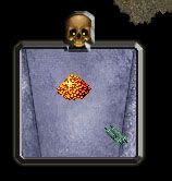
Here's the death bag, also from years ago. Changed slightly since then:
-Bicchus Dicchus, forgot how he was gonna finish this and left to eat some hot chilli